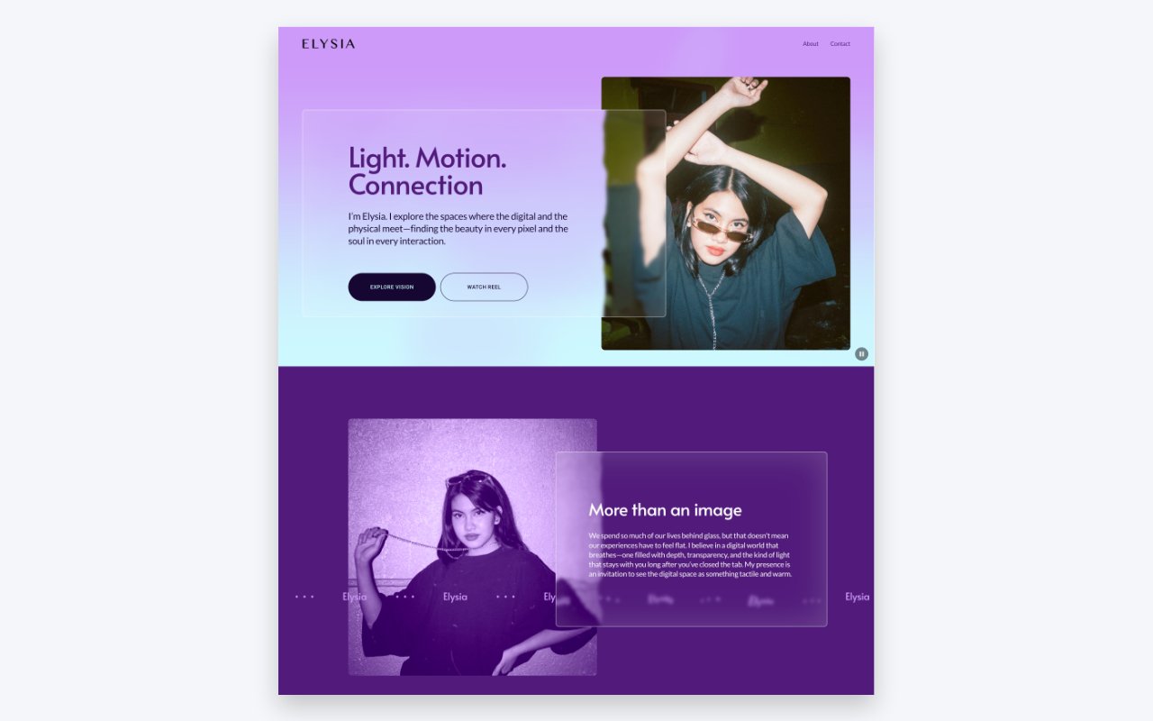
Have you ever noticed how some websites feel “expensive” while others just feel flat? Usually, the secret sauce is depth. Adding a background blur is one of the quickest ways to make a standard site feel more modern and immersive.
In this guide, I’m going to show you an easy no-code way to get background blurs, and then we’ll “hijack” that setting with a tiny bit of code to create something similar to liquid glass.
The Easy Way: The No-Code Background Blur
If you’ve tried using the Shape Block to create a blur, you probably noticed a problem: it blurs the shape itself, not the content behind it. That’s not what we want.
Instead, Squarespace has blur toggles in blocks like Text, Accordions, and Newsletters. Here’s the workaround to use them as background containers:
- Create an empty Text Block: Use this as your “container.”
- Enable the Blur: In the block settings, toggle the blur on and adjust the amount.
- Style it: Add a border with light opacity and round the corners. This keeps the blur from feeling “messy” at the edges.
- Layer your content: Move your actual text or buttons on top of this empty block.
Pro Tip: Be careful with contrast! Always make sure your background doesn’t make your text impossible to read. Your users’ eyes will thank you.
Level Up: The Liquid Glass Effect
The standard blur looks great a majority of sites, but if you want that liquid distortion, we have to go a step further. This effect looks best when you have something moving behind it, like a parallax background. I came across this code on the Better Stack YouTube channel, and made some modifications. Be sure to check out that video for an additional way to get the liquid glass effect.
1. Add the SVG Filter
First, you’ll need to add an SVG filter. This acts as the “lens” that distorts the light. Paste the SVG code into your Footer Code Injection or a Code Block. You won’t see it on the page, but it’s working behind the scenes.
SVG Code
<svg style="display:none;">
  <filter id="filter">
    <feTurbulence
      type="turbulence"
      baseFrequency="0.01"
      numOctaves="2"
      result="turbulence" />
    <feDisplacementMap
      in="SourceGraphic"
      in2="turbulence"
      scale="30"
      xChannelSelector="R"
      yChannelSelector="G" />
  </filter>
</svg>
2. Apply the CSS
Next, we target the backdrop-filter in your Custom CSS panel. Instead of a standard blur, we point it to that specific SVG ID.
.fe-block[style*="backdrop-filter"] {
  backdrop-filter: url("#filter") blur(4px) !important;
  border: 1px solid rgba(255, 255, 255, .4);
  box-shadow: inset 0 0 80px rgba(255, 255, 255, .15);
}
Note: You won’t see this effect while in “Edit Mode.” You’ll need to save and switch to Preview Mode to see the liquid distortion in action.
How to Customize the Distortion
If you want the “liquid” to look more or less intense, you can make adjustments to the SVG code.
- Base Frequency: Adjusting this changes the “tightness” of the waves.
- Scale: Changing this value (e.g., from 30 to 50) makes the distortion more drastic.
The Scroll Test: To see how strong your effect is, try dragging a Scrolling Block behind your glass container. You’ll see the words warp and distort as they pass by—it’s a great way to dial in the look.
Watch the Full Walkthrough
If you want to see exactly how I layer these blocks and tweak the settings in real-time, check out the video below: