So your business is ready to build or rebuild a website. Usually, the first instinct is to jump straight into a design tool, pick out some cool fonts, and find the perfect color palette. It’s the fun part. But I’ve seen that this is exactly what leads to sites that look great but fail to convert.
Before I touch a single design tool, there’s a planning process I go through that completely changes the outcome. Because at the end of the day, the planning is the work. As soon as you start designing, you start making decisions based on what looks good, not what your customers actually want.
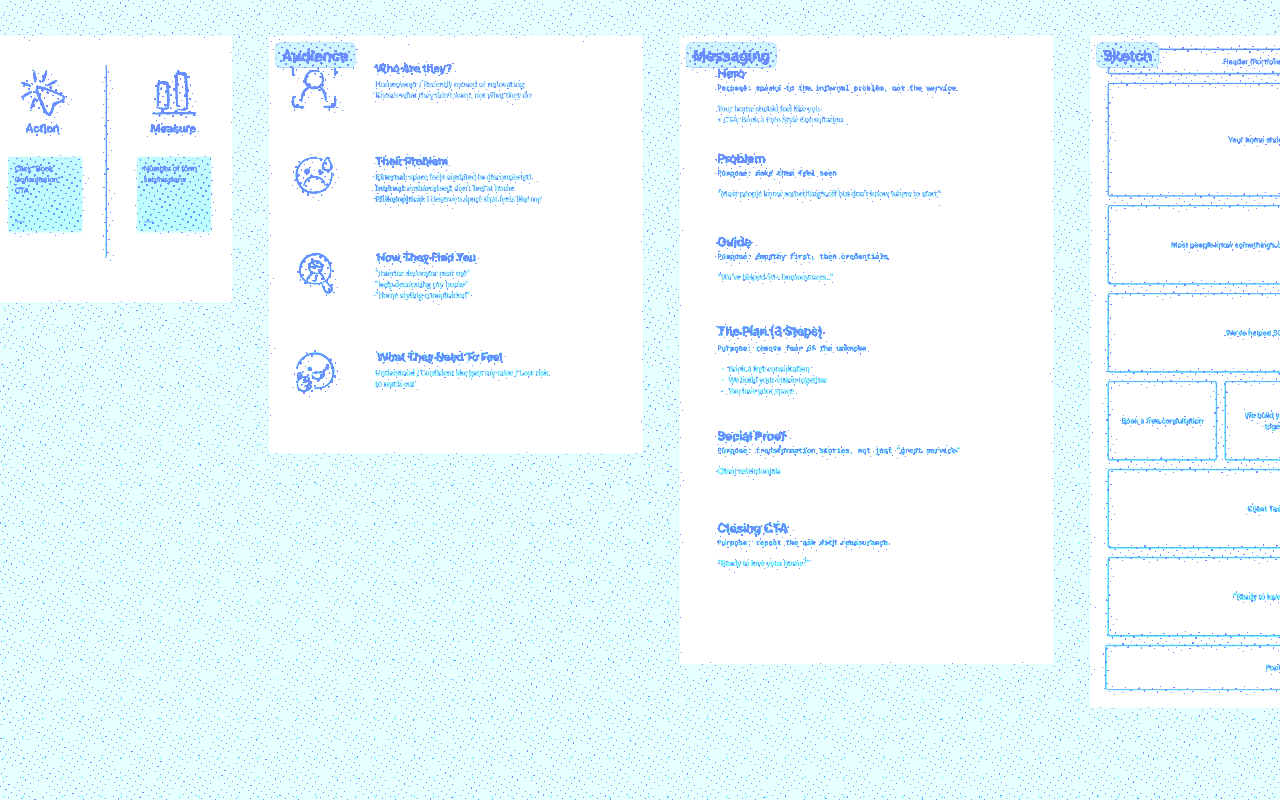
Here is the framework I use to build landing pages that actually do their job.
1. Define Your North Star (The Goal)
First thing’s first: you have to know what you’re trying to achieve. I always document three specific things before I start:
- The Goal: What do you want to happen? (e.g., Book a consultation).
- The Action: What physical step does the user take? (e.g., Click the “Book Now” CTA).
- The Measure: How do you track it? (e.g., Form submissions).
If you can’t measure it, it’s really hard to tell if your site is working. I like to stick to one primary goal per page to keep the user focused.
2. Know Who You’re Talking To
Once the goal is set, we need to figure out who is actually visiting the site. I focus on four main questions:
- Who are they?
- What is their specific problem?
- How are they finding you?
- What do they need to feel?
Pro Tip: For small businesses that don’t have a huge pool of users to survey, AI research tools like Notebook LM are a lifesaver. Another trick I love? Type your service into Google and see what the autocomplete gives you. It’s a direct window into the search terms people are actually using.
3. Messaging: The Framework for Connection
Even if your site structure is perfect, bad messaging will kill your conversion rate. I’m a big fan of the StoryBrand framework by Donald Miller.
The biggest shift here is realizing that the hero of the story is your visitor—not you. You are the Guide.
- The Hero/Problem: Make the visitor feel seen by addressing their internal frustration.
- The Guide: This is where you introduce yourself with empathy and credentials.
- The 3-Step Plan: This removes the “fear of the unknown.” Show them exactly how easy it is to work with you.
- Social Proof: Use stories of transformation, not just generic “great service” reviews.
4. Sketching it Out (The Wireframe)
Only after I have the goals and the messaging down do I start sketching. I use a whiteboarding tool like FigJam, but you could honestly use a physical whiteboard or a piece of paper.
I’m just transferring that messaging into a layout:
- Hero: Hook them.
- Problem: Make them feel seen.
- Guide/Plan: Build trust and remove friction.
- Testimonials: Let your clients do the selling.
- Final CTA: Seal the deal.
Watch the Full Walkthrough
I walked through this entire process using a fictitious interior decorator as an example. You can see the full thinking behind each step in the video below: