As web designers, it’s easy to get locked into a single tool. We live in Figma, we design in Figma, and we prototype in Figma. But sometimes, staying in one lane limits what we can create.
In this post, I want to share a recent experiment where I shook up my standard workflow by combining Affinity and Figma. I set out to design a “Print Style” hero section, featuring noisy textures and custom vector art, specifically to test how these two powerful tools can work together to unlock new creative possibilities.
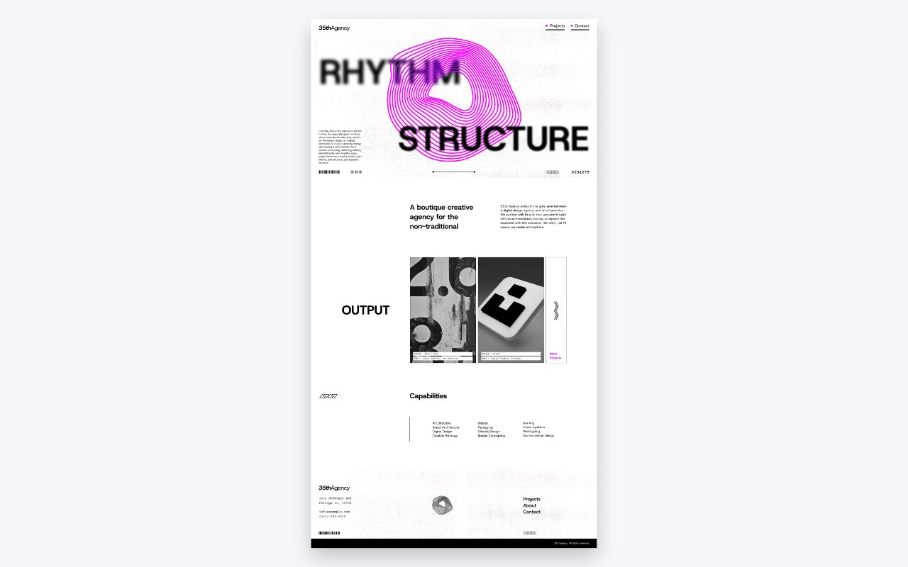
Gathering Inspiration: The “Print Style” Aesthetic
Before jumping into design I start with a mood board. For this project, I didn’t just look at other websites; I pulled inspiration from print posters.
I was really drawn to designs that utilized high-contrast black and white, heavy film grain noise, and blurred typography. There is something really engaging about combining distinct, sharp icons with abstract, “messy” textures. The goal was to push the boundaries of a standard web hero section to make it feel tangible and gritty, just like those posters.
Starting in Affinity: Crafting Custom Vectors
You might be wondering, “Why not just use Figma plugins or download a library?”
While you absolutely can do that, I wanted to improve my skills in Affinity. Plus, Affinity has specific vector tools—like the Warp Mesh—that offer way more control for creating abstract organic shapes than Figma currently does.
The Process I started by setting up a column and row grid in Affinity that would match the one I intended to use in Figma. This makes transferring the design later incredibly smooth.
Once the grid was set, I dove into the fun stuff:
- Abstract Art: I used Affinity’s warp tools to twist and manipulate shapes into that fluid, abstract imagery you see in the center of the hero. It’s perfect for that “distorted print” look.
- Blurred Typography: I used two layers of the same text, one crisp and in front, and one heavily blurred behind the illustration. This creates a fake 3D depth of field that looks awesome on screen.
- Icons and Illustrations: For the smaller details, I leaned on Affinity’s built-in shape tools.
- Navigation: Since this is still a website, usability matters. I added small colored squares to the navigation items to guide the eye and ensure the menu didn’t get lost in the abstract noise.
Moving to Figma: Layout & Composition
One of the biggest misconceptions is that moving between design apps is a headache. In reality, moving from Affinity to Figma is seamless. I simply exported my vectors as SVGs and dropped them right into my Figma file.
Refining the Layout I recreated my grid in Figma and started placing those custom Affinity assets.I also fleshed out the rest of the page layout here, using Figma’s native tools to create simpler geometric elements like triangles and lines to balance out the complex organic shapes from Affinity.
Bringing it to Life in the Browser (Squarespace)
A design should translate seamlessly to the browser. I chose Squarespace to build this out quickly, but since we are working with standard Figma, this design could be implemented in other platforms.
Implementation Details
- SVG Code Blocks: Instead of uploading images, I opened my SVGs in a text editor, copied the code, and pasted it directly into code blocks. This keeps the file sizes low and ensures the vectors are crisp on every screen size.
- Custom CSS & Parallax: To enhance the depth, I added a bit of custom CSS. I set up a scroll animation so the abstract art and the blurred text move at different speeds (parallax), giving the user a sense of movement as they scroll down.
- Texture & Noise: I used a CSS effect to overlay an additional film grain noise on the background image.
- Responsiveness: Finally, I wrote some media queries to adjust the font scaling on mobile, ensuring that massive typography didn’t break the layout on smaller phones.
Conclusion
It might seem like overkill to use two different design tools for one website section, but the mental switch can do wonders for your creativity. Affinity Designer allowed me to create assets I wouldn’t have made in Figma, and Figma allowed me to compose them into a functional web layout perfectly.
If you’re feeling stuck in a rut with your current design workflow, try incorporating a new tool for just one part of the process. You might be surprised by the results.
Check out the full video below to see the timelapse of the design and build: